My work show was on 17 June, i made a installation as a platform and my own space to present my works, instead of handing works on the wall or placing on the table. Using handy material by picking up chairs at downstairs. The chair is elegant, concise and colorful, which caters to the style of my works.
In the AKI Festival, i joined the graphic print workshop; we were asked to make a self-portrait and an object which could relate to or represent yourself.
On the left side, i printed it with natural colors, which is referred to the colors from fruits and vegetables by pressuring. On the right side's is printed with chemical colors.
"Visible and invisible" these two words pop-up into my mind, when I started to make a design of play card. Nature always my favorite theme to focus on, I used my nature photography as the main visual image and apart the it into six to topics. The sentence of " more than a design" alway in my mind when I branstorm, it could be a piece of art, an object, or a deceration .....
The word of press has a lot of meaning ; urgent, publish, pressure ..... ; I uses this # simbol which people may associate jail or subtitle presents some rude words and others; i paint this # on every newspapers which indicates something cant publish on the newspaper and obstacles.
This is an illustration assignment given by Roland Sips. I used some Chinese characters which the meaning could tell from shape, and i put my illustrations on the right page, which relate to the character,further there is a Chinese phonetic symbols above, thus, you can get the meaning of character from the illustrations and the shape, learn the pronunciation as well.
This assignment is to make a flip book, my idea is taking daily photos of refrigerator for over a month, i printed the photos and cut into two parts, one is for Roland, the other is for me.
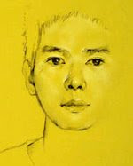
I am trying to use different medias and techniques to present the Portrait, Maybe i've addicted in painting again, i hope that i can go on and make a progress on this assignment.